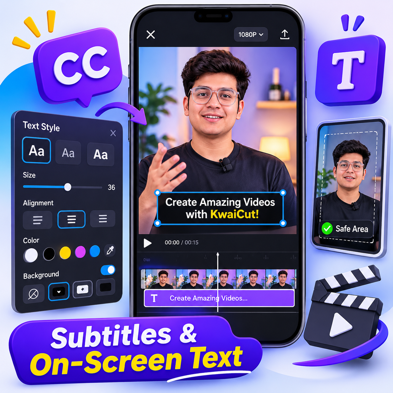
Updated: November 22, 2026 · Text and subtitle design · By Kawya Aki
Good subtitles do more than repeat spoken words. They help viewers follow a tutorial in a noisy place, understand a quick explanation, and stay with a video when the sound is turned off. But text can also make an edit harder to watch when it is too small, appears for too little time, covers the subject, or changes style every few seconds. This guide focuses on one specific part of KwaiCut: planning, styling, timing, and placing subtitles and on-screen text so that the finished video feels clear and consistent.
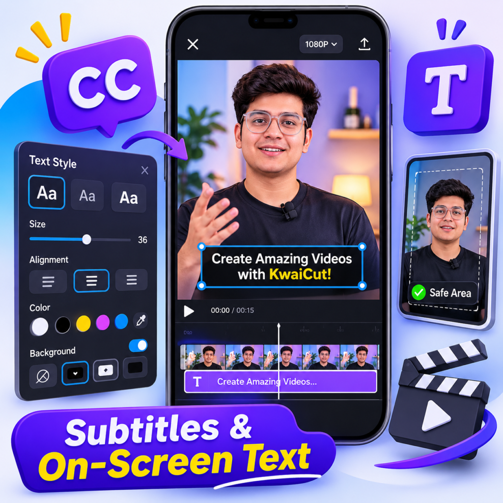
What this article covers: The official KwaiCut app listing describes manual subtitle adding and editing, a library of subtitle styles and dynamic effects, plus text-related creative materials. The exact labels and available controls can change with the app version. The design advice below is a practical workflow, not a claim that every device has identical buttons or presets.
Table of Contents
- Subtitles vs. decorative text
- Plan the words before styling
- Choose a readable subtitle style
- Make text readable over moving footage
- Place text where it will not be covered
- Match subtitle timing to speech
- Design titles and callouts
- Build a consistent visual identity
- A practical KwaiCut text workflow
- Review before exporting
- Common text-design mistakes
- Frequently asked questions
1. Subtitles and Decorative Text Have Different Jobs
Subtitles represent what a speaker says. They should be accurate, easy to follow, and timed closely enough that viewers can connect each line with the spoken words. A title or callout has a different purpose: it introduces a subject, names a step, points out a detail, or gives a short instruction. Treating both as the same element can create clutter. For example, if a tutorial already has dialogue captions at the bottom, adding a second long sentence in the same area forces viewers to read two things at once.
Before adding text, decide what the viewer needs to know. Use subtitles for spoken information. Use a short heading for a new section, and use a brief callout only when it adds information that is not already obvious from the narration. If the video is a silent demonstration, concise step labels may be more useful than pretending there is dialogue to caption.
2. Plan the Words Before You Open the Style Library
It is tempting to choose an animated style first and then fit the words into it. A better approach is to prepare the text before decorating it. Write down the key sentence or phrase, remove repeated words that do not change the meaning, and check spelling and names. For spoken subtitles, preserve the speaker’s actual meaning rather than rewriting a sentence so heavily that it says something different.
Break long speech into short, natural reading groups. A viewer should be able to read a line while still watching the action. Avoid placing a complete paragraph on the screen at once. If a sentence is too long for a comfortable caption, split it at a natural phrase boundary and give each part enough screen time. Do not split a name, number, or short phrase in a way that makes it confusing.
For a how-to video, a simple text plan can look like this:
- Opening: one short line that tells viewers what they will learn.
- Step label: a few words naming the current action.
- Dialogue captions: the spoken explanation, divided into readable phrases.
- Important warning: a concise note only when a genuine caution is needed.
- Ending: a short next step or summary, not a wall of text.
3. Choose a Readable KwaiCut Subtitle Style
KwaiCut’s official store description lists manual subtitle tools and a collection of subtitle styles and dynamic effects. These options can help a creator establish a look, but the most animated preset is not automatically the best one. Start with a simple style that remains readable over the footage. A clean sans-serif typeface, regular or medium weight, and a clear difference between the letters and their background are sensible starting points.
Use bold styling selectively. It can help a short label stand out, but making every word heavy, outlined, shadowed, and brightly coloured weakens the hierarchy. Keep the main caption style stable through the video. If you want to emphasise one word, use a modest change in weight or colour rather than changing the entire caption design.
Try a style on a bright shot, a dark shot, and a busy shot before applying it throughout the project. A treatment that looks excellent over a plain wall may disappear when the footage contains trees, signs, clothing patterns, or fast movement. Previewing different backgrounds early prevents repeated corrections later.
4. Make Text Readable Over Moving Footage
Text needs enough contrast from the picture behind it. White letters can work well over dark footage, while dark letters may work over a light, uncluttered area. When the background changes from shot to shot, a subtle semi-transparent backing or a restrained outline can help keep the words visible. Do not rely on colour alone to communicate meaning; a warning should use clear wording or a familiar symbol as well as a colour difference.
Keep effects under control. Thick outlines, large shadows, glow, and bouncing animation can make small captions harder to read. If the background is already busy, simplify the text treatment instead of adding more decoration. The goal is for the words to be understood on the first viewing, not for the styling to compete with the footage.
Check the result on the phone screen at normal viewing size. Zooming into the preview can make tiny text seem more readable than it will be to someone watching the exported video. If a friend needs to pause to read an ordinary caption, shorten it, enlarge it, or leave it visible for longer.
5. Place Text Inside a Safe Area
Do not place important words right against the top, bottom, or side edges. Social platforms can overlay buttons, account names, descriptions, and other interface elements on top of a video. Their layouts may also change, and different placements can crop or cover different parts of the frame. Keep captions, titles, and logos comfortably inside the picture and check the final video in the destination app before publishing.
For a vertical video, the lower edge is often a risky place for important text because platform controls and descriptions may occupy that region. If the speaker’s face or the product demonstration is near the bottom, moving the captions slightly higher may also prevent them from covering the subject. For landscape video, keep text away from the extreme edges and check the result in both full-screen and embedded playback.
There is no single pixel margin that works for every platform and every screen. Use the preview as a guide, leave generous breathing room, and perform a real-device check. The World Food Programme’s safe-zone guidance also recommends keeping text and graphic elements within the designated safe area and checking visibility on the intended platform.
6. Match Subtitle Timing to the Speaker
Even attractive captions fail when they appear too early, disappear before the sentence ends, or remain on screen long after the speaker has moved on. In KwaiCut, use the manual subtitle editing controls available in your version to adjust each text segment’s position and duration on the timeline. The exact gesture or menu name may vary, so check the controls displayed by your installed app rather than relying on an old screenshot.
Start each caption when the relevant phrase begins and leave it visible long enough to read. Avoid showing a new line while the previous one is still needed. When a speaker pauses, do not automatically leave a long caption on screen if the next shot communicates a new idea. For fast speech, split the sentence into more manageable parts or consider whether the narration itself should be shortened and recorded more clearly.
After adjusting timing, play the whole section rather than checking only the first frame of each caption. Watch for words that flash by, lines that overlap, and captions that remain after a cut to a new topic. The U.S. Section 508 guidance recommends keeping captions readable, consistent, and in short lines; its examples are useful as a practical reference, although the best timing still depends on the language, pace, and audience.
7. Design Titles, Labels, and Callouts Separately
A title introduces the subject, so it can be larger than a dialogue caption. A step label tells viewers where they are in a process. A callout points to one important detail. Give these elements a clear visual hierarchy: the title should be most noticeable, the step label should be easy to scan, and dialogue captions should remain calm and consistent.
Keep titles concise. “Adjust the clip volume” is easier to process than a full paragraph explaining every tap. If a step needs more detail, let the narration or the caption explain it. A callout should point to something visible in the video; avoid placing an arrow or label where it hides the very control the viewer needs to see.
Use animation to introduce or remove a title only when it helps the viewer notice a section change. Constant movement can distract from demonstrations and make captions harder to follow. A simple appearance, a short hold, and a clean exit are often enough.
8. Create a Consistent Look Across Your Videos
If you publish a series of tutorials, viewers should recognise that the videos belong together. Choose one main caption style, one title treatment, and a small set of colours. Use the same alignment and similar spacing across episodes. You do not need to make every video identical; the footage and examples can change while the text system remains familiar.
Keep a simple note outside the project with your chosen style: font appearance, approximate size, text colour, backing treatment, alignment, and usual placement. When you start another edit, use that note as a reference and compare the new result with a previous export. This is a practical consistency method; it does not depend on a dedicated brand-kit or preset feature being available in KwaiCut.
Use custom stickers or decorative elements only when they support the message. The official app listing describes sticker importing and management, but that does not mean every downloaded image is free to use. Use artwork you created, own, or have permission to include, and avoid adding a logo or watermark that could mislead viewers about who made the video.
9. A Practical KwaiCut Text Workflow
Use this sequence for a new tutorial or talking-head video. It is deliberately tool-agnostic where the app interface may differ between versions:
- Finish the basic edit first. Arrange the clips and remove unnecessary pauses before spending time on text.
- Prepare the wording. Check the script or listen to the final voice recording and write accurate subtitle lines.
- Add the subtitles. Use the manual subtitle feature shown in your KwaiCut version and divide long speech into natural sections.
- Choose one main style. Select a readable preset, then adjust its appearance if the available controls allow it.
- Set timing and placement. Match the words to the speech and keep them clear of faces, demonstrations, and platform interface areas.
- Add titles and callouts last. Use them only where they add context that the subtitles do not already provide.
- Preview difficult shots. Check bright, dark, and busy backgrounds, plus any fast scene changes.
- Export a short test if needed. Watch the saved file on your phone before exporting or publishing the full final version.
10. Review the Export, Not Just the Editing Preview
The editing preview is not the final viewing experience. After export, watch the saved video from beginning to end. Check spelling, punctuation, line breaks, timing, and whether any caption disappears during a transition. Look at the video in the orientation and approximate size in which people will watch it. If the platform adds its own captions or overlays, confirm that your text remains visible.
Also consider accessibility. Captions should not be the only way to communicate a critical instruction if the information can also be included in narration or the accompanying post description. Avoid rapid flashing effects and excessive movement. The W3C’s media accessibility guidance highlights the importance of readable overlay text, adequate contrast, and not making viewers depend on visual information alone.
11. Common Text-Design Mistakes to Avoid
- Too many fonts: use a small, consistent type system rather than changing typeface on every line.
- Captions too small: check them at normal phone size, not only while zoomed into the editor.
- Low contrast: add a restrained background or choose a clearer colour combination.
- Text near the edges: leave room for platform controls and different screen layouts.
- Overlong captions: divide speech into short, natural reading groups.
- Unmatched timing: review captions with the actual audio, not by looking at the timeline alone.
- Decorative overload: use animation, glow, outlines, and stickers sparingly.
- Unlicensed artwork: use only text, stickers, and graphics that you have permission to publish.
Related KwaiCut Guides
Continue learning with these related guides from KwaiCutGuide:
- KwaiCut Features and Tools Explained
- KwaiCut Video Editor: Complete Beginner’s Guide
- Plan Better Videos Before Editing in KwaiCut
- Fix KwaiCut Export Problems
Frequently Asked Questions
Quick answers about making captions and on-screen text clearer in KwaiCut. Some controls may look different depending on your app version.
Does KwaiCut support manual subtitles?
Yes. The official app listing describes manual subtitle adding and editing tools, along with a library of subtitle styles and dynamic effects. The exact options can vary by version.
Can I use animated subtitle styles?
The official listing mentions dynamic subtitle effects. Use them selectively and make sure the words remain visible long enough to read.
Why do my subtitles disappear behind app buttons?
They may be too close to the edge where a platform places its interface. Move important text inward, leave generous margins, and preview the video in the destination app.
Should every word have a different colour?
No. Keep the main caption treatment consistent. Use a small amount of emphasis only when it helps viewers identify an important word or phrase.
How many lines should a subtitle contain?
Keep captions brief and easy to scan. One or two lines are usually easier to follow than a paragraph, but the right break depends on the spoken phrase and the available screen space.
Can I add a title and subtitles at the same time?
You can use both, but avoid placing two long messages in the same area. Give the title a clear role and keep dialogue captions separate so viewers know what to read first.
Why are my captions difficult to read on some clips?
The footage may have a bright or busy background. Try a subtle backing, stronger contrast, or a different position, then review the result at normal phone size.
Can I use imported stickers with my captions?
The official listing describes custom sticker import and management. Use only graphics you own or have permission to use, and avoid letting stickers cover important words.
Should I check captions after exporting?
Yes. Watch the saved file from beginning to end to check spelling, timing, visibility, and whether platform overlays cover any important text.
Where can I confirm KwaiCut’s current text features?
Check the current official Google Play or Apple App Store listing and the controls visible in your installed app. Feature names and availability can change with updates.
Official Information and Further Reading
For current app features, check the publisher’s KwaiCut Google Play listing and KwaiCut Apple App Store listing. For general accessibility principles, see the Section 508 caption guidance, the W3C media accessibility guidance, and the WFP safe-zone guidance.
Editorial note: KwaiCutGuide is an independent educational website. It is not affiliated with, endorsed by, or an official support channel for Kwai or KwaiCut. App features and interface labels may change. Always check the current app version and the rights attached to any third-party material before publishing.
About the Author
Kawya Aki writes practical learning resources for KwaiCutGuide, focusing on mobile video editing, clear creative workflows, and responsible publishing. Each guide aims to explain not just where a tool may be found, but how to use it in a way that helps viewers.